

What to Look For in a GEO Service Provider Before You Sign On
Reads
604
8 Apr. 2015 - Michael Simonetti, BSc BE MTE - Total Reads 11,628

We are addicted to our mobile phones, mobile websites are not just important, they are now mandatory. With Google announcing that you’ll loose search rankings if your mobile sites are not optimised by the end of April and daily mobile (non-voice) use is closing in on 3 hours per day, there is no better time to launch a specific mobile site.
Yes, we are certainly addicted to our mobiles. Just think about the last time you left it at home, or cracked the screen or worst, lost it. Think about going a week, even a day without it. I don’t last an hour outside sleep checking my mobile. I’m betting if you surveyed one hundred people, loosing your mobile will probably be the second greatest fear behind public speaking.
They travel everywhere we do, we sleep next to them, we take them to the loo (we’ll 75% of us do1, and 63% admit answering phone calls on the dunny!). We use and communicate with them more each day than anything else, or anyone else on the planet. Stats from eMarketer show the incline on mobile use is clearly data (not phone calls) and we now average almost 3 hours a day on our device.
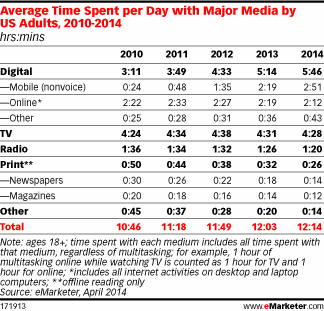
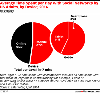
Image Sources : http://www.emarketer.com/Article/Mobile-Continues-Steal-Share-of-US-Adults-Daily-Time-Spent-with-Media/1010782
As we all extend mobile as the preferred online device, marketers are still slow to react. Many have not rounded out their service offering with a mobile specific website. Common reasons are lack of budget or resources, and when weighed up against the potential risks, the ‘people can still navigate our site on mobile’ seems to be a common response.
&Mine haven’t built a project without a mobile specific website for a year and have pushed the notion that most users will not persist with a desktop website on mobile. We’ve certainly seen desktop legacy sites with atrocious ‘time on site’ results for mobile users, sometimes with bounce rates as high as 90%, and the other 10%… we’ll I’m guessing they are desperate for some information but probably get fed up at some point – just beyond bounce rate (like after an initial click-and-try-my-luck).
With Google announcing that mobile search results will now be pushed to sites that are optimised for mobile, here are our top 5 tips to building or adapting your site to meet the needs of today’s online consumer and keep the Google Search Bots happy.
using Google’s Mobile Optimisation Tool. The tool can be found here ( Webmaster Tool ) and illustrates what, if anything you need to do to get your website mobile ready. We’ve probably fixed a hundred sites in the last year in need of a mobile update so likely yours will need improvements too.
A mobile site should be simple, super simple. If possible limit actions on a mobile site to a single click per page plus hamburger navigation (Hamburger navigation is those 3 little horizontal bars in the top of mobile apps or websites). Really look at each page and think what single action do I want the user to do on this page, this will help you define what is important and what to remove.
should be limited to actions that can be easily performed on mobile. Remove any complex pages with content outside the scope of a mobile screen-size, for example, if you have a complex report with far too much information on a page OR say you have a some functionality that is desktop only – like a CRM screen, review points 2 and 4 before deciding to keep it in the mobile version of your site.
. Responsive design is not the cost effective savior of mobile. When your website responds down on a responsive grid to mobile size from the size above (typically tablet), all of the pages should be reduced in complexity of content, functionality, and most importantly they should appear in a single column. This mobile version of your site is exactly that – a mobile version with elements adjusted on page for the mobile viewer, not just all the content on page re-worked to fit mobile. While this sounds like a subtle change, it has major benefits if done correctly for your engagement and ultimately if someone engages with your brand.
This is one we’ve been pushing for a while. Like digital should lead advertising, mobile should lead digital. We all want simpler services, easier choices and mobile’s screen limitations, and subsequent strategies are delivering this for users. We feel this should be taken a step further and lead the simplicity of desktop sites where ever possible. Especially when there is marketing and advertising involved and the job is to convert a lead source. There is no better way than to provide a clear, succinct value proposition to the user, with a single call to action.
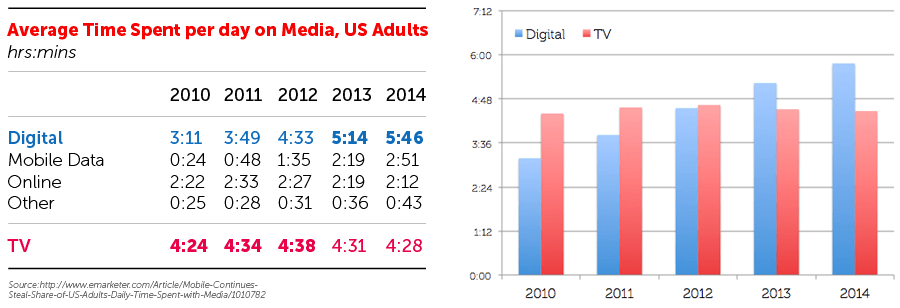
Based on the stats, mobile isn’t a fad, it has become the core of communications. If the curve continues we will see mobile leading online functionality, advertising dollars and marketing objectives within the next 12 to 24 months. It all depends on how fast we catch on and adapt our strategies. The ideal start is integrating all 5 tips above to your digital ecosystem and watching the change in your data pre and post changes.
1. http://www.cnet.com/news/it-in-the-toilet-study-shows-cell-phones-big-in-bathroom/
The AndMine team have been delivering our digital strategy and online services for many years now. Strongly commercially aware they know our industry well and have consistently delivered winning results for Matchbox. David Cohen, Owner, Matchbox
More Testimonials































































































































































































































Comments